Checkboxes: Boolean;
The Checkboxes property determines whether elements of the ListView component have checkboxes.
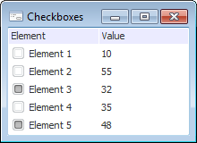
If the property is set to True, the checkboxes are placed near the elements of the component. The property is set to False by default, the checkboxes are not displayed.
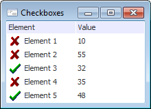
If the StateImages property is determined for the component and Checkboxes = True, the two first images of the StateImages collection are used to display the checkbox state (selected or deselected) for the elements. The image with the 0 index is used for the deselected checkboxes, the image with the -1 index is used for the selected checkboxes.
Checkboxes=True; StateImages=Null;

Checkboxes=True; StateImages<>Null;

See also: